
Coffee & Friends
A handcrafted visual identity created to capture the warmth, comfort, and social rituals around local artisan coffee.
Client: Broz Cafe Industry: Hospitality / Café Services: Brand Identity, Packaging, Print Design
Packaging
Concept
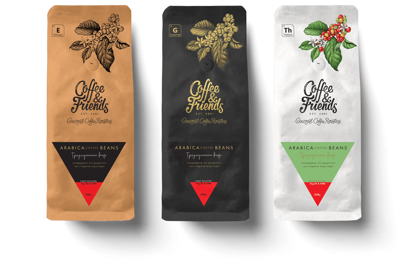
The Craft Blend: The kraft packaging highlights the artisanal nature of the blend, while botanical illustrations reinforce the brand's warm and handcrafted aesthetic.
The Dark Roast: The black packaging differentiates the dark roast through a bold and sophisticated aesthetic, while metallic botanical details reinforce its premium, handcrafted character.
The Single Origin: The clean white packaging emphasizes purity and highlights the distinctive character of carefully sourced single-origin beans.
Logo
System
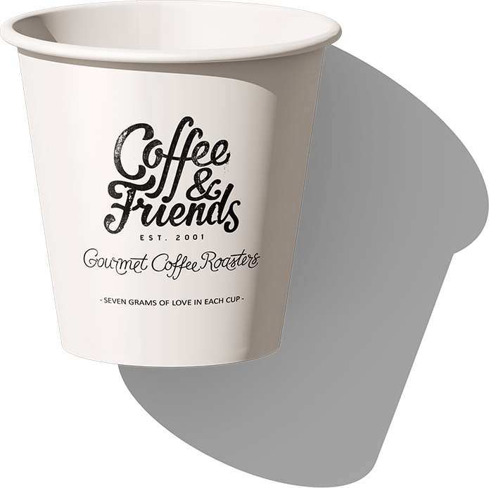
Primary Logo: builds emotional connection and expresses the brand's handcrafted nature. Horizontal Logo: ensures flexibility and readability across different formats. Monogram Badge: offers scalability and instant recognition in limited space.
Brand
Communication
& Typography
The expressive typography embraces spontaneity and imperfection, capturing the brand's free-spirited, handcrafted character and prioritizing personality over rigid rules. The charm of hand-painted café signage creates a visual language that feels authentic and approachable. Rather than striving for typographic precision, the design celebrates individuality and human touch, reinforcing the warm and welcoming atmosphere of Coffee & Friends.
Menu
Board
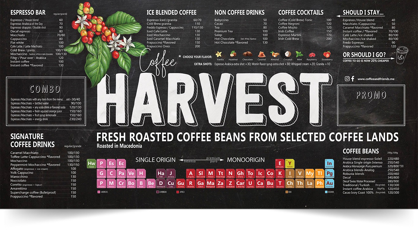
A clear information hierarchy, expressive typography, and handcrafted illustrations transform the menu board into an engaging extension of the Coffee & Friends brand experience. The chalkboard aesthetic reinforces the brand's artisanal character while creating a warm and inviting in-store experience.
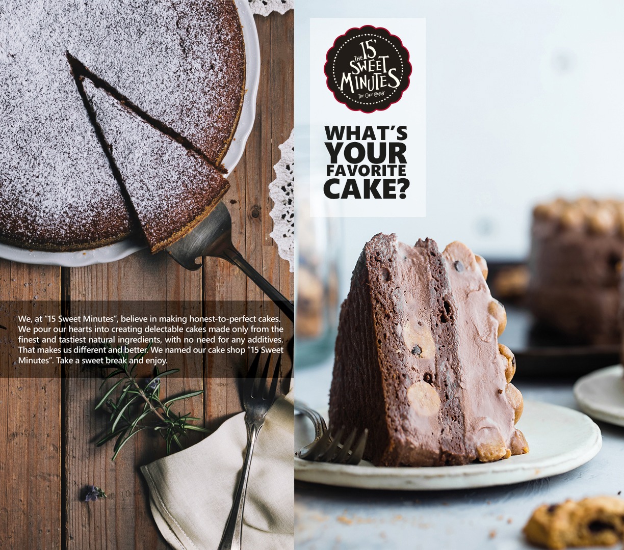
The 15 Sweet Minutes
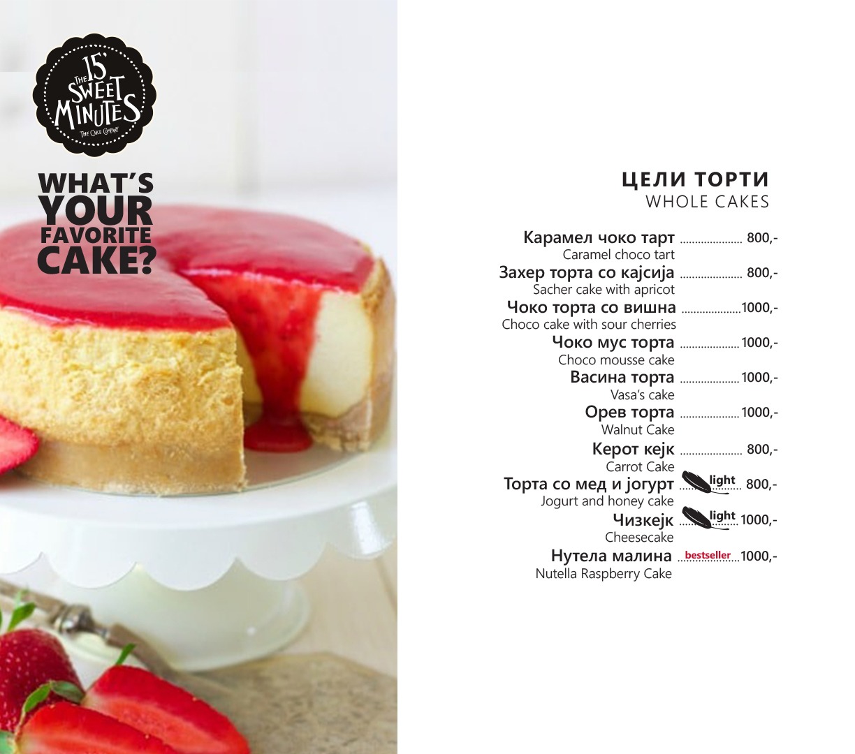
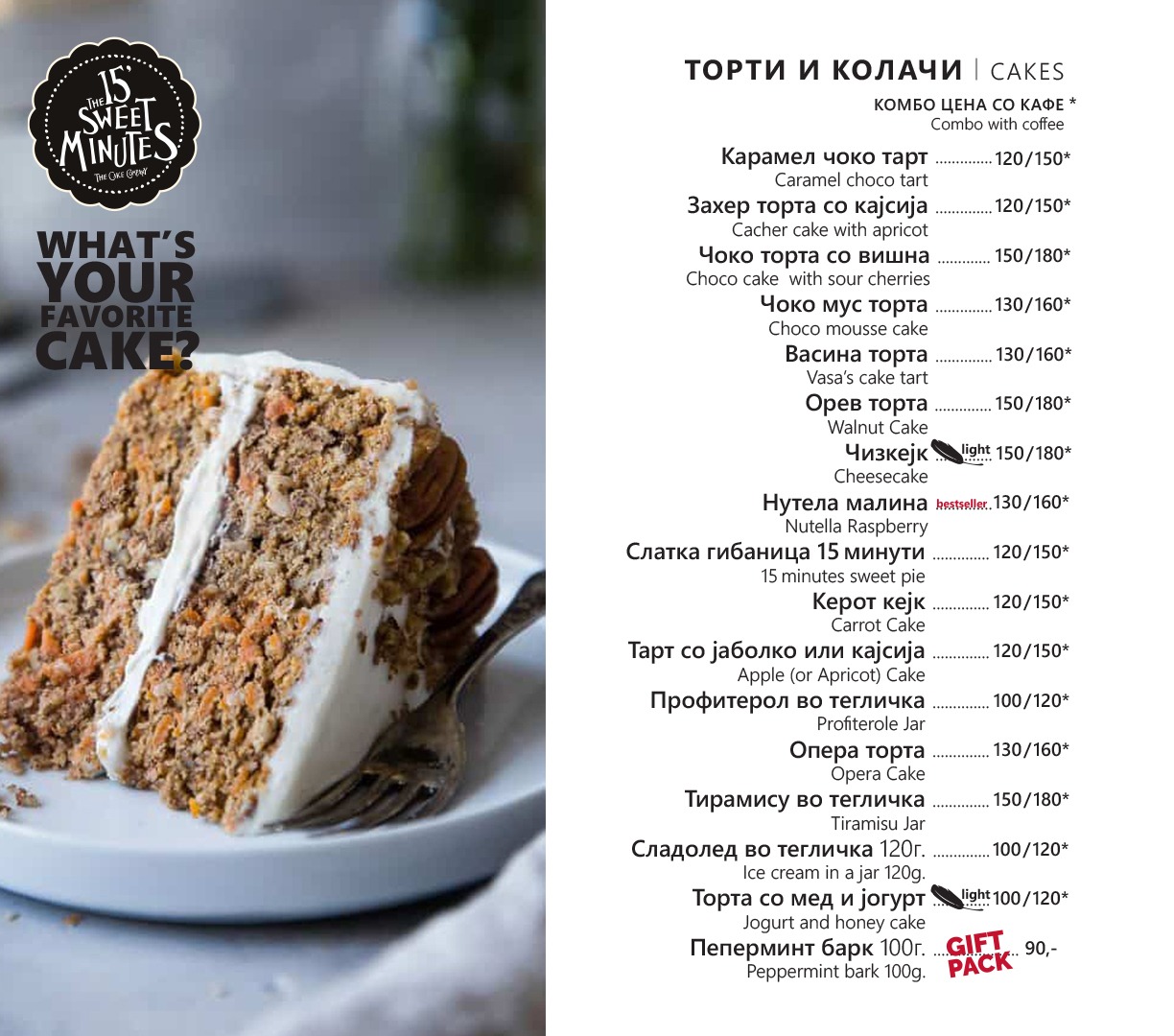
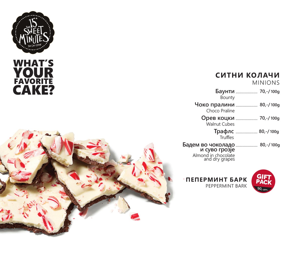
15 Sweet Minutes extends the Coffee & Friends identity, celebrating the simple pleasure of coffee and indulgent desserts that transform everyday moments into sweet rituals.
Menu
A beautiful layout crafted for effortless browsing. Clear information hierarchy meets expressive typography to turn our selection of treats into a visual extension of the brand experience.